Map Dashboard

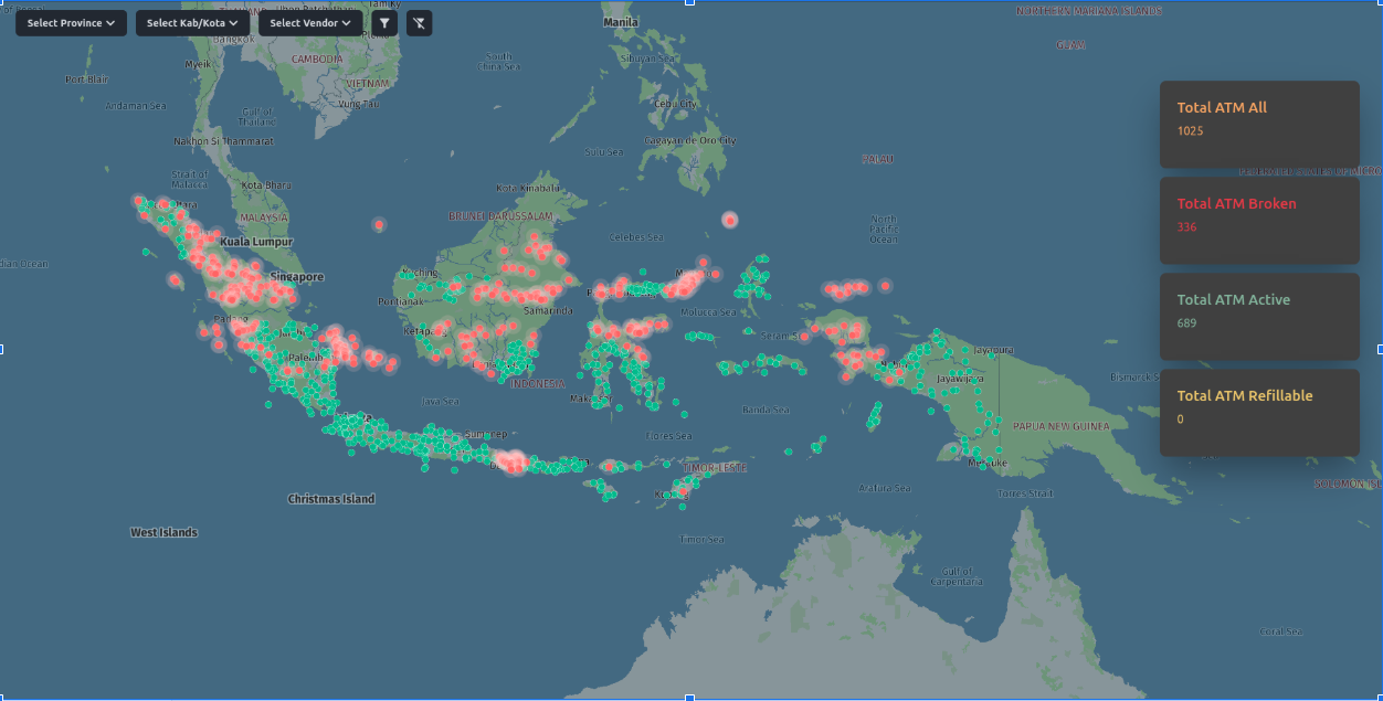
The map dashboard provides a clear overview of the entire ATM network at a glance. Each ATM is color-coded — red for depleted, green for operational — so field teams can quickly identify units that need attention. Clicking any marker reveals real-time status details for that specific ATM.
This approach simplifies daily operations: teams spend less time checking individual machines and more time handling replenishments where they matter most.

Detailed Analytics

The detail view surfaces key metrics for each ATM — daily depletion rates, transaction volume, and current operational status. These insights help teams understand usage patterns and schedule maintenance proactively rather than reactively.
Points of Interest Integration

Integrated HERE Maps POI data to display nearby landmarks — restaurants, offices, malls, and banks — around each ATM. This context helps operations teams assess location performance and optimize replenishment routes based on surrounding foot traffic.
